Shopify PDP Examples
Before and after product page examples built around conversion, trust, and AOV.
This page shows what usually holds a Shopify product page back and what a stronger commercial version looks like instead. The goal is not prettier design. The goal is a page that sells with less friction.
What this page is for
Use these patterns if you are reviewing a Shopify PDP and need a sharper read on what is reducing buying confidence.
Each teardown pairs a live PDP screenshot with an after mock that respects the merchant's palette and typography tokens—focused on hierarchy and trust, not generic filler layouts.
Best used for
- Shopify CRO reviews
- PDP redesign planning
- Agency teardown decks
- AOV and trust optimization work
Real PDP teardown · 01
Salvida barrier bundle: stronger above-fold conversion story.
The current page has the right raw material: specialist proof, clear product imagery, review volume, delivery clarity, and a bundle offer. The after version tightens the first screen around the buyer's real job: feel safe choosing a sensitive-skin routine.
Before
Current first screen
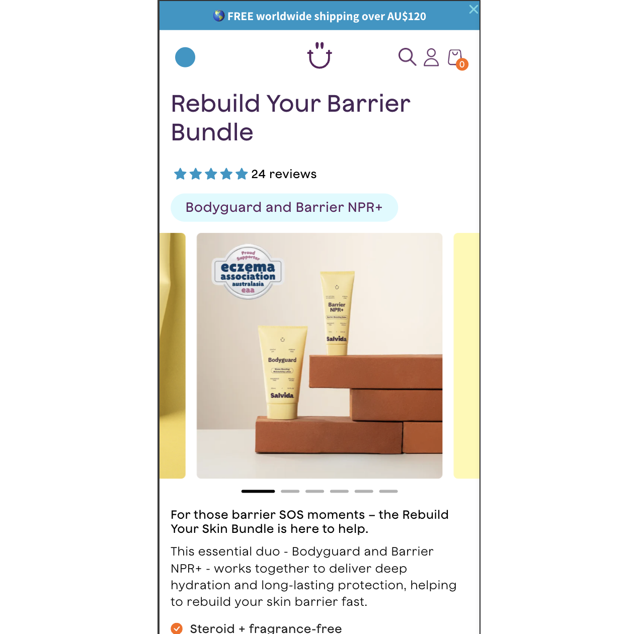
The eczema proof is visually present, but the value of that proof is not translated into a sharper first-screen promise.
The strongest buyer anxiety, "will this irritate my skin?", is answered after the CTA instead of directly before it.
The bundle discount is shown, but the page does not make the two-step barrier repair routine feel immediately more valuable than buying one product.
After
Above-fold CRO rewrite
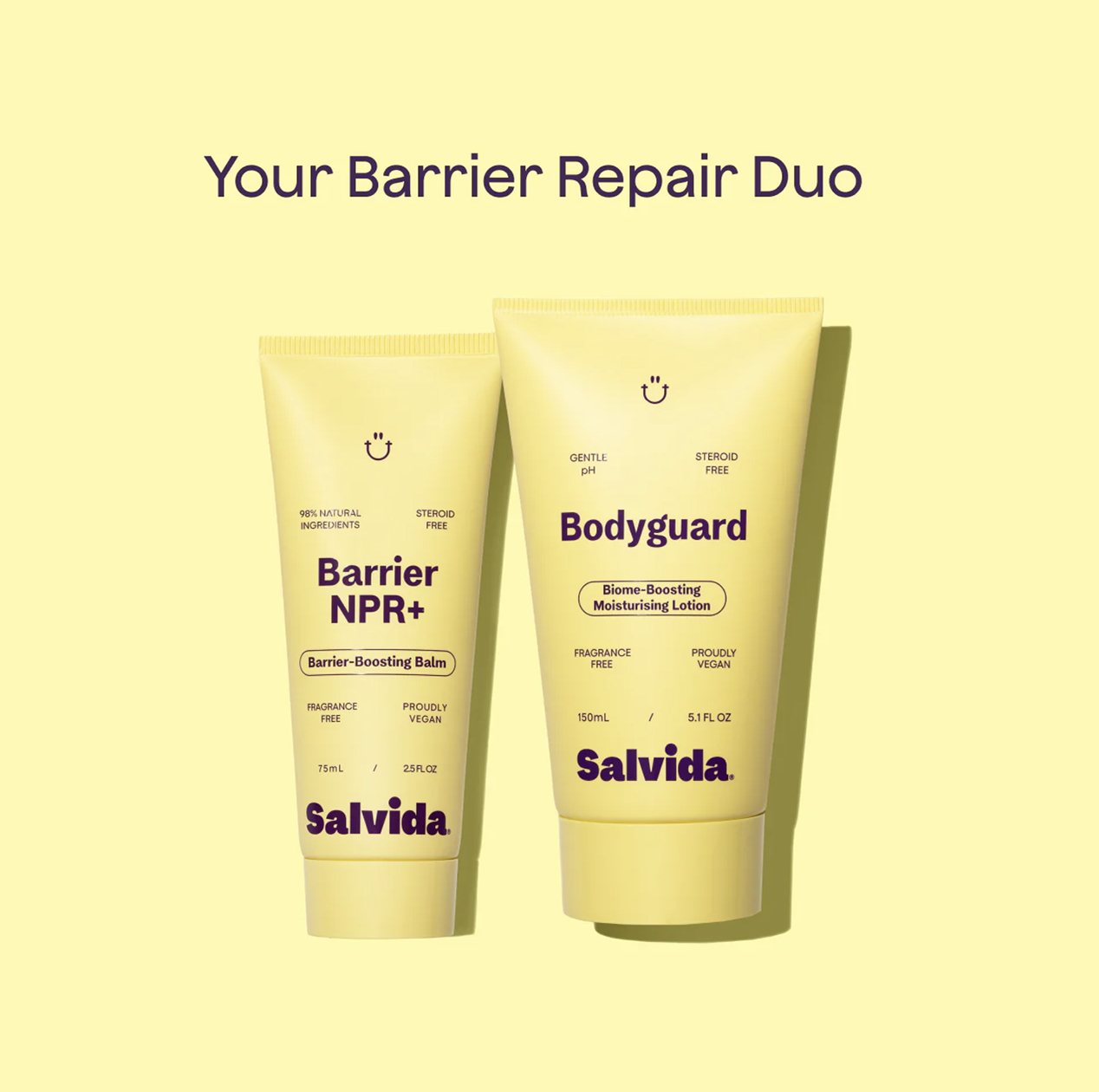
2-step barrier routine
Body hydration plus targeted barrier balm for flare-up prone skin.
For barrier SOS moments
Rebuild calmer-feeling skin with a dermatologist-tested duo.
Pair daily Bodyguard hydration with Barrier NPR+ balm to help protect dry, sensitive skin and support a stronger barrier routine.
Best for first-time barrier repair shoppers.
Sensitive-skin reassurance before the click
"No reaction on my super sensitive eczema, this felt really nice after using."
Real PDP teardown · 02
Samsara Cycle endurance bib: calm the buy box, sharpen the promise.
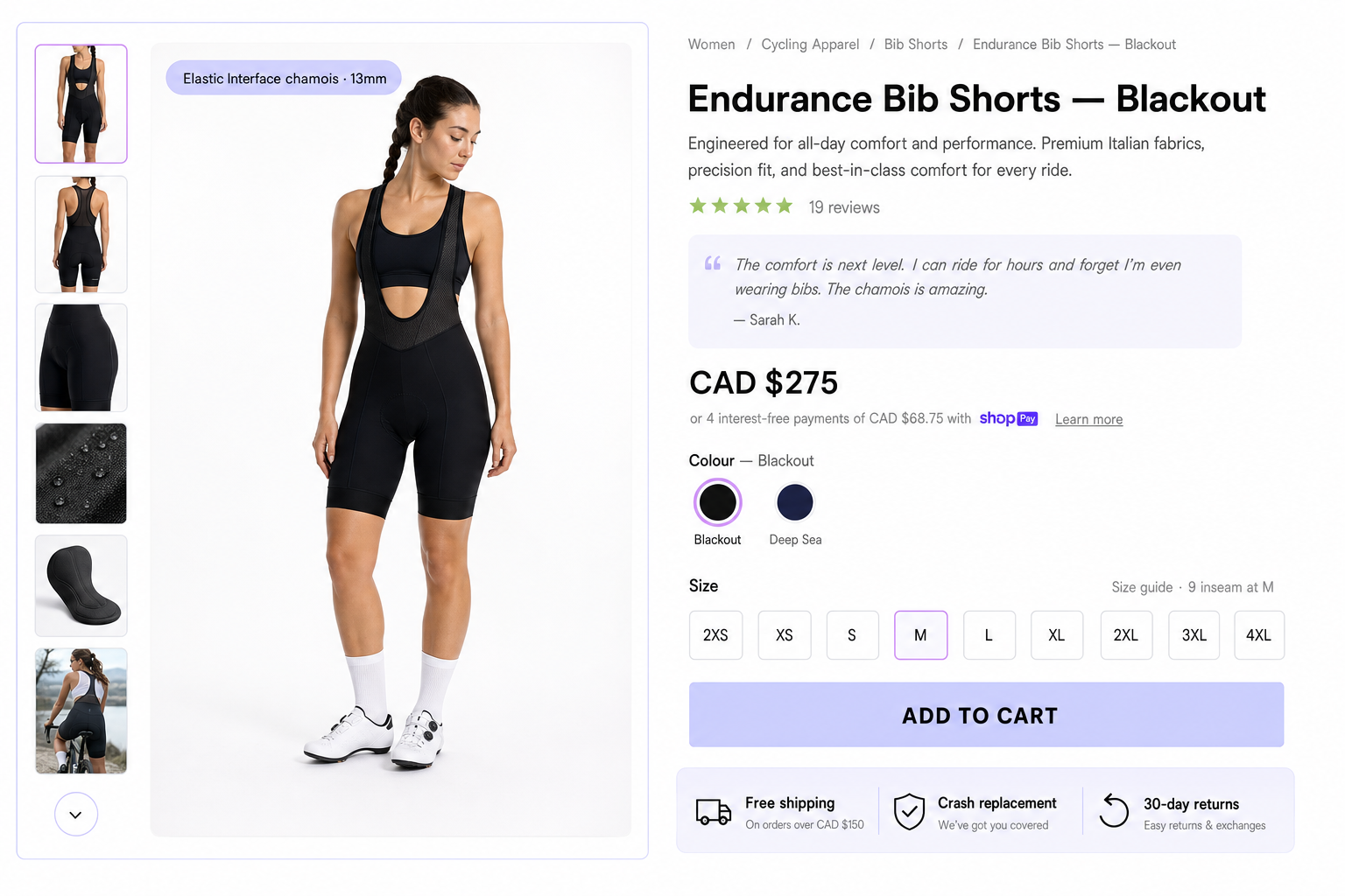
Women's premium cycling apparel with strong reviews and rich product detail—but the first screen can still bury the commercial story. Below we mirror the familiar Shopify pattern on Endurance Bib Shorts · Blackout and show a tighter CRO sequence: outcome first, proof at the decision moment, inventory and fit anxiety handled without alarming copy.
Before
Current first screen
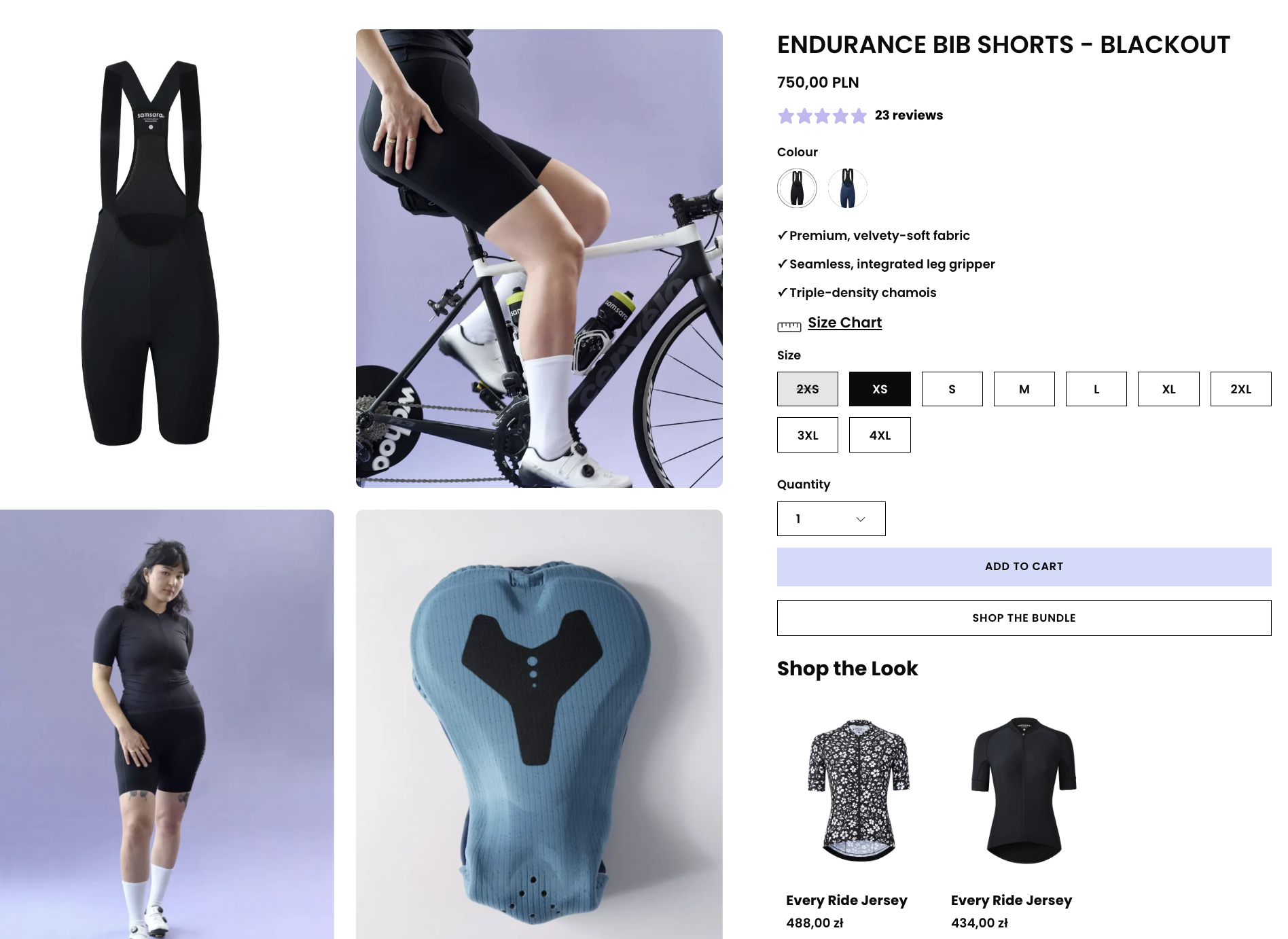
Stock and cart messaging (“not enough of this product”) reads like a dead end before the shopper has locked a size—anxiety spikes right at intent.
The hero story is mostly the product title and spec bullets; the “for long rides / why this chamois wins” outcome is implicit instead of spelled out above the fold.
Pricing shows a strikethrough “sale” with identical numbers, which adds visual noise without clarifying value or urgency.
Strong review proof (100% five-star cohort) sits far below the buy box, so hesitation on fit and performance is not answered at the click.
After
Above-fold CRO rewrite
Real PDP teardown · 03
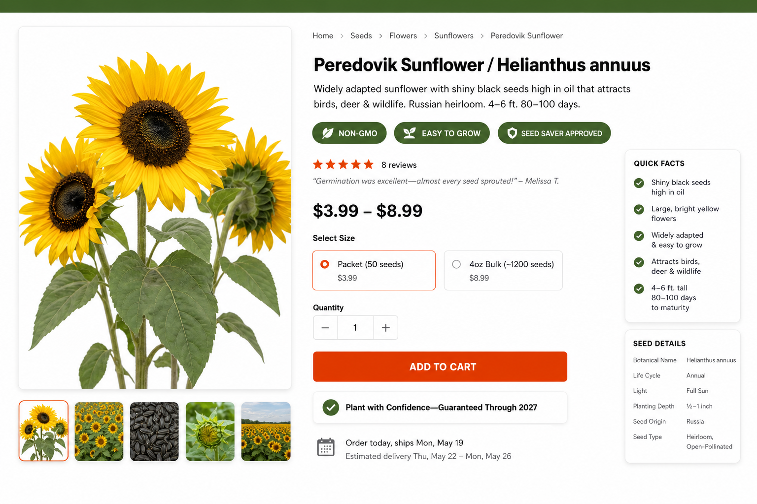
Thresh Seed Peredovik sunflower: seed confidence at the decision moment.
Heirloom positioning and guarantee copy are strong on Peredovik Sunflower, but PDPs like this often bury germination reassurance and shipping clarity under long accordions. The after mock keeps Montserrat hierarchy and the forest green, burnt orange, and sunlit yellow accents—while tightening what appears beside ATC.
Before
Current first screen
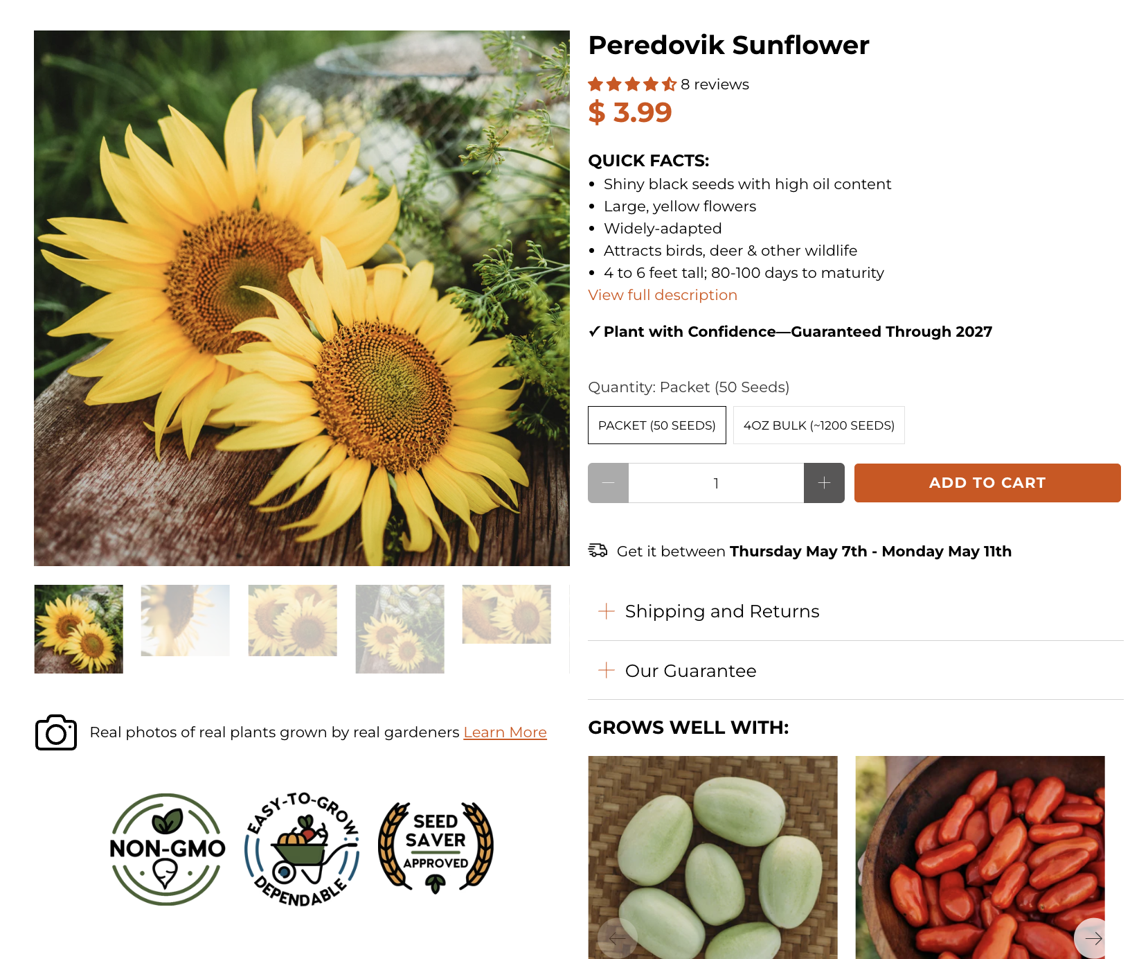
Shipping timing reads ambiguous when estimates collapse into placeholders—seed shoppers hesitate because sowing seasons are date-sensitive.
The deepest credibility (wildlife plot story, Soviet heirloom arc, germination reassurance) sits behind accordions while the buy column stays SKU-forward.
Packet versus bulk is an economic fork without inline guidance on “who each option is for,” which slows confident variant selection.
Strong aggregate reviews live far below the fold; germination proof does not reinforce the primary anxiety beside price and ATC.
After
Brand-aligned CRO mock
Next step
Want this level of critique on your actual product page?
HiveSense reviews the real storefront, not a generic template. It surfaces the trust gaps, hierarchy issues, merchandising misses, checkout friction, and AOV opportunities most likely to matter commercially.